Abstract
Analyzing baby names can offer a quantitative perspective to the otherwise difficult problem of mapping immigration regions to states. This project seeks to identify names that are correlated with specific immigrant regions: Europe, Africa, Asia, Oceania and the Americas. From there, we are able to see where these names show up over time on a state-by-state level. While this analysis can track names that originate from these regions, it does not necessarily do so. Instead, it allows for examination of “immigrant” names by region. We use Principal Component Analysis to reduce the dimensions of the data for each region mentioned above and then visualize the components as a means for examining nationwide immigration trends over time. This analysis can then be used to understand the mechanisms of cultural assimilation, and how certain names are associated with different ethnic groups. It offers insight into important trends in immigration on a state-by-state level that may be useful for future local and federal policy decisions.
Introduction
Names can tell us a lot about society changing over time. On the most basic level, they have the ability to shape how a child is seen. However, they are not only important on an individual level, but can offer insight to larger societal trends. From names, we can derive a the type of people that are living in a society. This can lead to conclusions about social trends and public opinion being made. Previous work on this topic include exploring trends in American parenting choices based on baby name choice. The study seeked to analyse whether there had been a decline or increase in individualism in America by looking at the frequency of a child receiving what was considered a common name. In another paper by Barucca et al, the authors are studying the cross-correlation of girl names by each state. They want to examine the correlations between the trends of baby names in states over time.
For our project, we are looking specifically at immigration trends within the US from five geographic regions: Europe, Asia, Africa, Oceania, and Americas. We look to see where these names by region are most popular (which we determine by prevalence of each name) in each of the 50 states. From there, we are able to extrapolate where immigrants from each region move to on a state by state level.
Approach
- The top 100 baby names for each region were identified by determining which names correlate to which of the five regions of immigration.
- Top names were determined by treating names as predictors for immigration from a region and computing R2 scores for each name for each region.
- For each region, we constructed matrices in which rows represent the US states (including D.C.) and columns represent the 100 names for that region.
- The value of each cell in the matrix is the overall count of that name in that state.
- To reduce the dimensions of these matrices, we used principal components analysis (PCA).
- The top two PCA components were used to visualize the similarity of names between states over time on a per decade basis.
- We also identified the most representative immigrant names for each state by normalizing the name frequencies across states.
Data
Data Sources
- National Level: name, year of birth, sex and number, are from a 100 percent sample of Social Security card applications after 1879
- State Level: From Social Security cards from 1910 onwards, 100% sample
- Immigration Data: From Census, happens every 10 years. Foreign born individuals include:
- Naturalized U.S. citizens
- Lawful permanent residents (immigrants)
- Temporary and humanitarian migrants (such as foreign students and refugees and asylees)
- Unauthorized migrants
Data Limitations
- State and national data do not span the same years
- Census data exists by decade - reduces our sample size to 15 when looking at correlations
- Data by count, not percent - disproportionately favors later years where more children are being born
Map Display - Discussion
The names that show up in these maps do not seem to be typical names that originate from the immigrant region themselves. Some of the most notable of these names are “Remington” as an Asian name, “Jeancarlos” as an African name and “Crimson” as a name from Oceania. The dissimilarity between these names, and names we culturally associate with these regions could come from a variety of sources. First of all, the representative names were based on correlation of immigration patterns and name emergence. From this data, we were unable to attribute a causal relationship between names and immigration patterns. The second reason is the multigenerational aspect to immigration and naming. As the baby names data set was created from Social Security filings from babies being born that year, the immigrant names from the regions may phase out as immigrants name their American-born children.
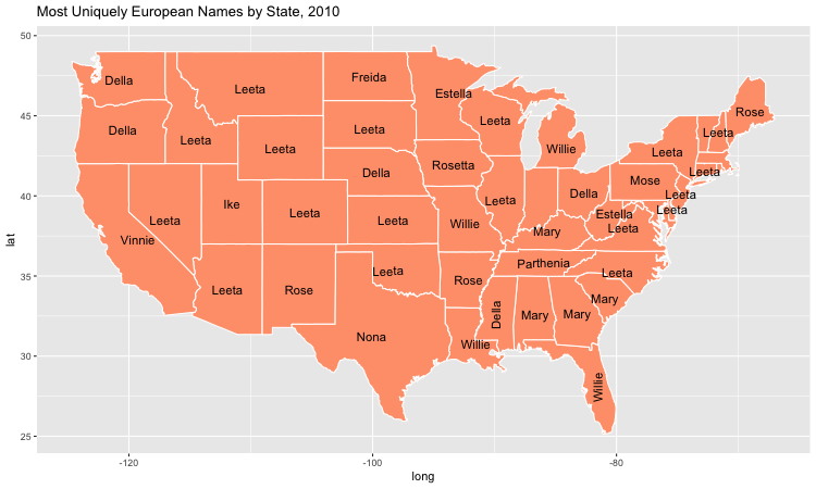
Most Unique Names From Europe
The European names are notable because they are comprised of girl names moreso than any other immigrant region. This indicates that European boy names and American boy names are similar. For example, James may be both a European and American boy name, but Dora is an especially European girl name.

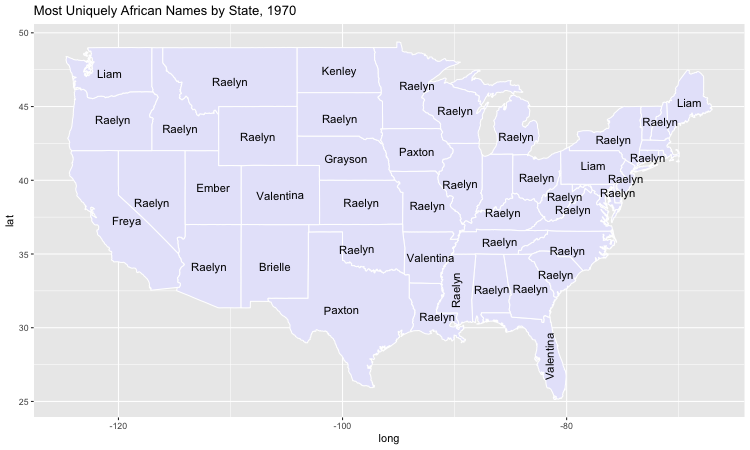
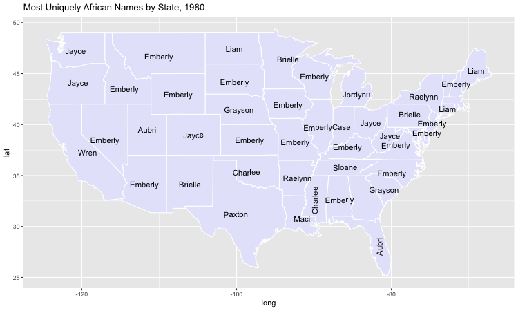
Most Unique Names From Africa
Up until 1970, the uniquely African names by state do not seem to vary much by state nor over decade. The name Sura and Weston disproportionately show up across the map. However, in 1980, many new names like Kolt, Callan, Raylon emerge. This indicates that there may have been a distinct change in immigrant names trends for these populations nationwide. This change corresponds with the doubling of African immigrants during this timeframe.
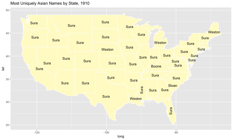
Most Unique Names From Asia
Sura is an incredibly representative name across different regions, times, and states. It shows up coast to coast in 1910 Asia, as well as in 1910 Africa and persists into the 2010 America map.
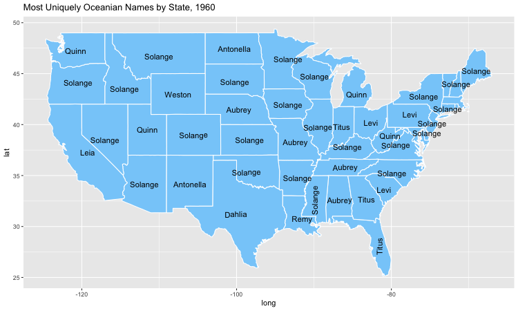
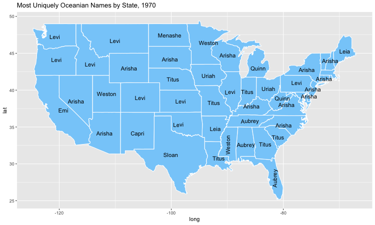
Most Unique Names From Oceania
There seems to be a large shift in naming cultures between 1960 and 1970. In 1960, the names were Solange and Aubrey. The next decade, the names shift to Levi and Arisha. This shift is associated with a mild increase in immigrants during these decades. However, the decade before the number of immigrants from Oceania doubled, while the names did not significantly change. This indicates that the shift in naming may have more cultural roots, as opposed to being a result of a demographic shift.
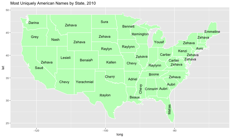
Most Unique Names From Americas
Grey is a very common representative name for the Americas. It appears in every decade from 1910 to 2010. American names have a noticeable difference in origin than the other regions. They comprise of the French sounding Cartier, the colorful Crimson and Grey, and the Hebrew Yerachmiel.
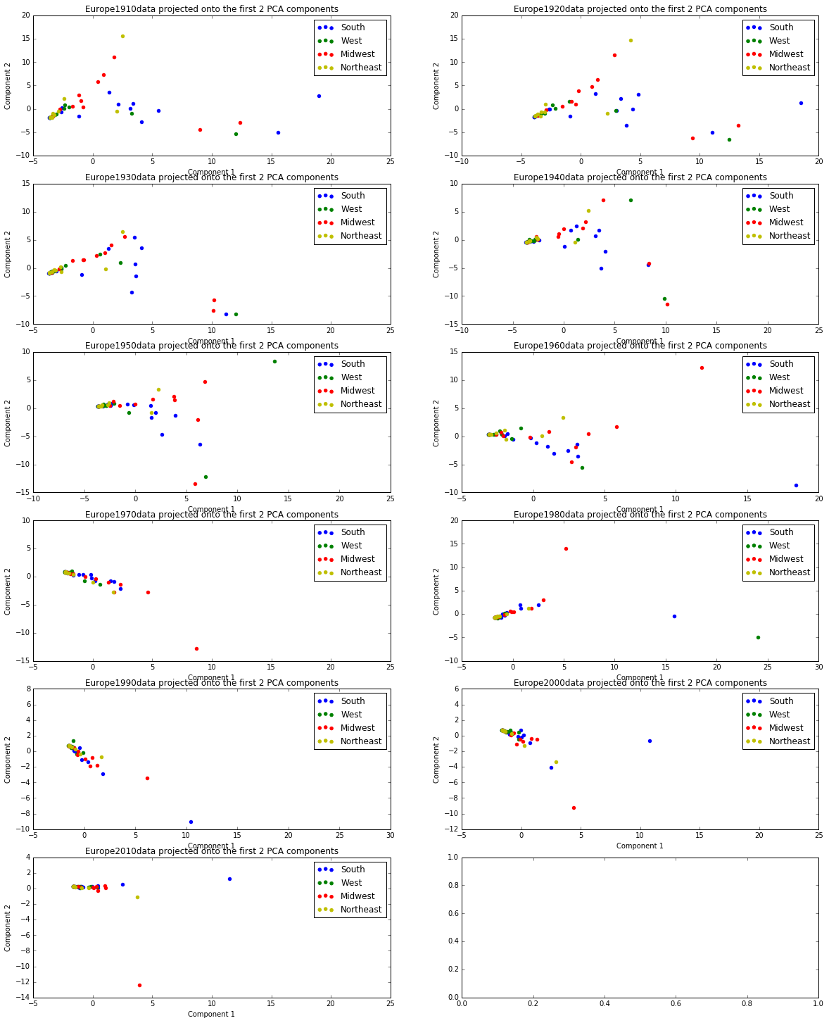
PCA for Europe
The Northeast is tightly clustered from 1910 to 2010, which could indicate one of two things. Firstly, the Northeast is smaller geographically than the other regions of the United States, therefore the names are more easily spread and popularized within this small region. Secondly, this could indicate that the same immigrant populations move disproportionately to the Northeast. This aligns with the general cultural knowledge that New York has many Italian immigrants, and Massachusetts has many Irish immigrants. Thus it would make sense for the names to be more closely clustered among these states.
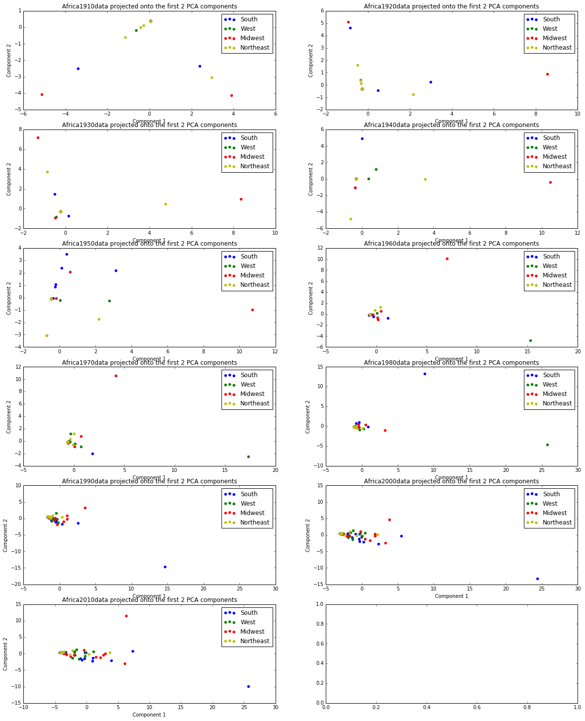
PCA for Africa
The principal components of Africa in the early 20th Century are very dispersed. Southern names cluster together before Northeastern names do, which is different than the other immigrant regions.
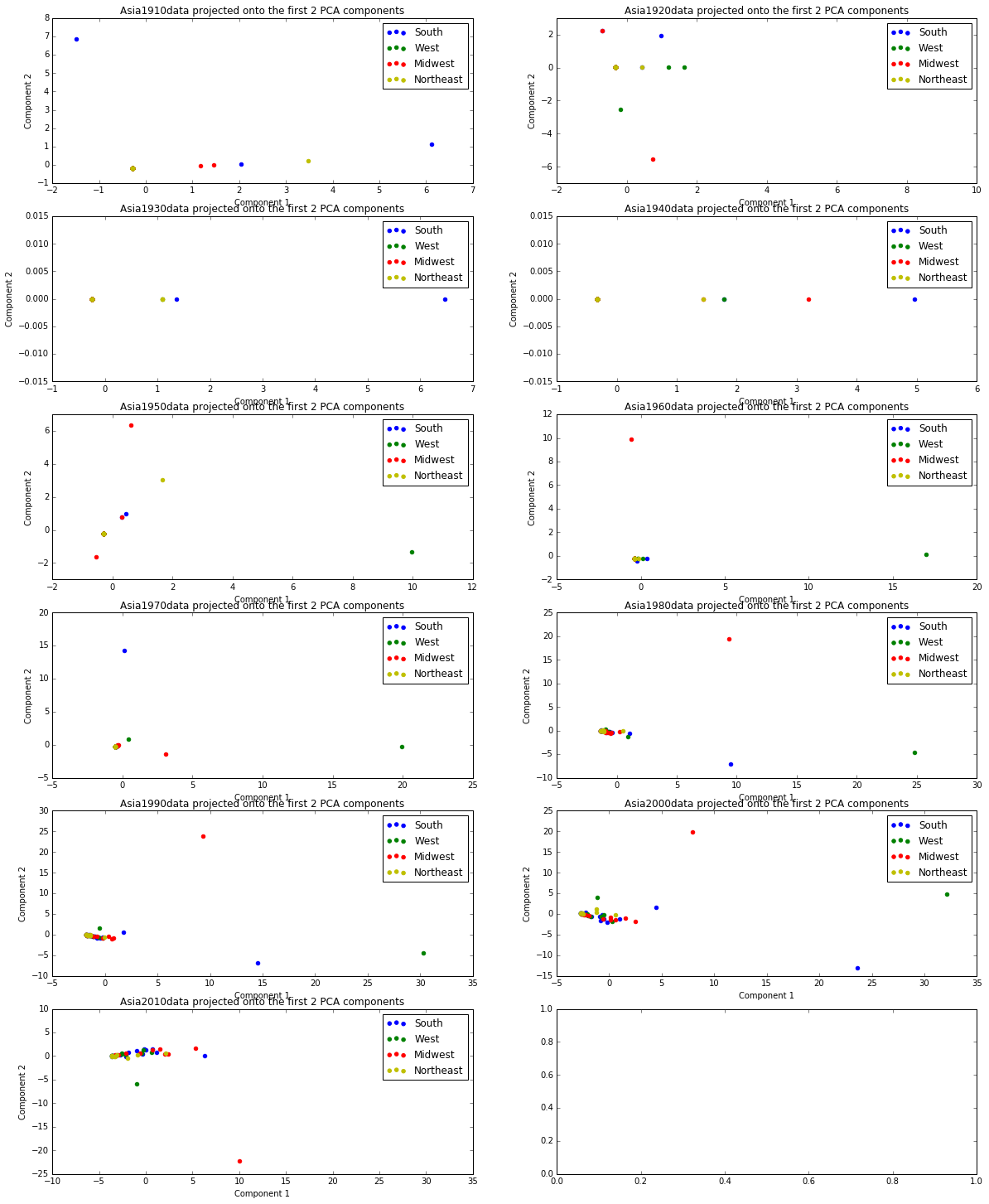
PCA for Asia
Asia quickly becomes clustered from 1970 to 1980. Between 1970 and 1980, there was a large wave of Asian immigrants, increasing in number from 824,887 to 2,539,777. Though it is unclear where exactly in Asia these immigrants came from, the principal components seem to have Russian origins (Nikolai, for example) which is an interesting name choice for the time, considering the Cold War was occurring at this time as well.
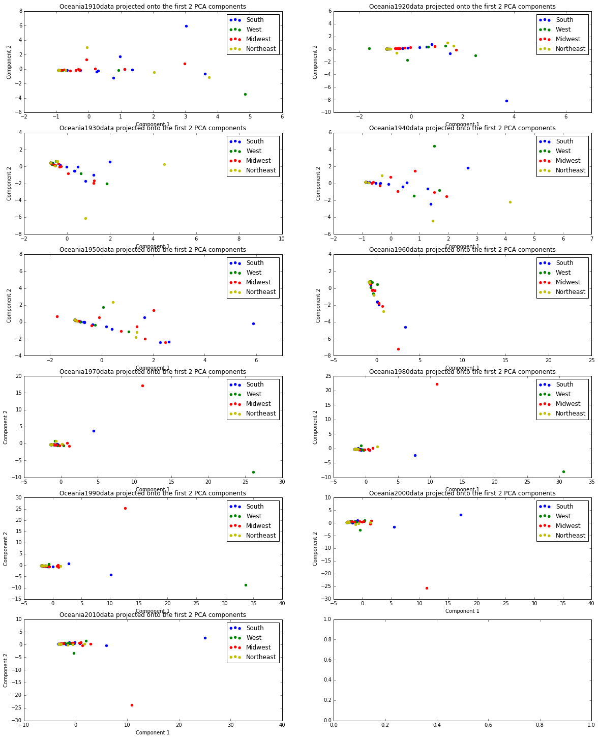
PCA for Oceania
The principal components of Oceania cluster around 1960. This is directly after a doubling of immigrants, similar to what happened to the Asia principal components in 1980.
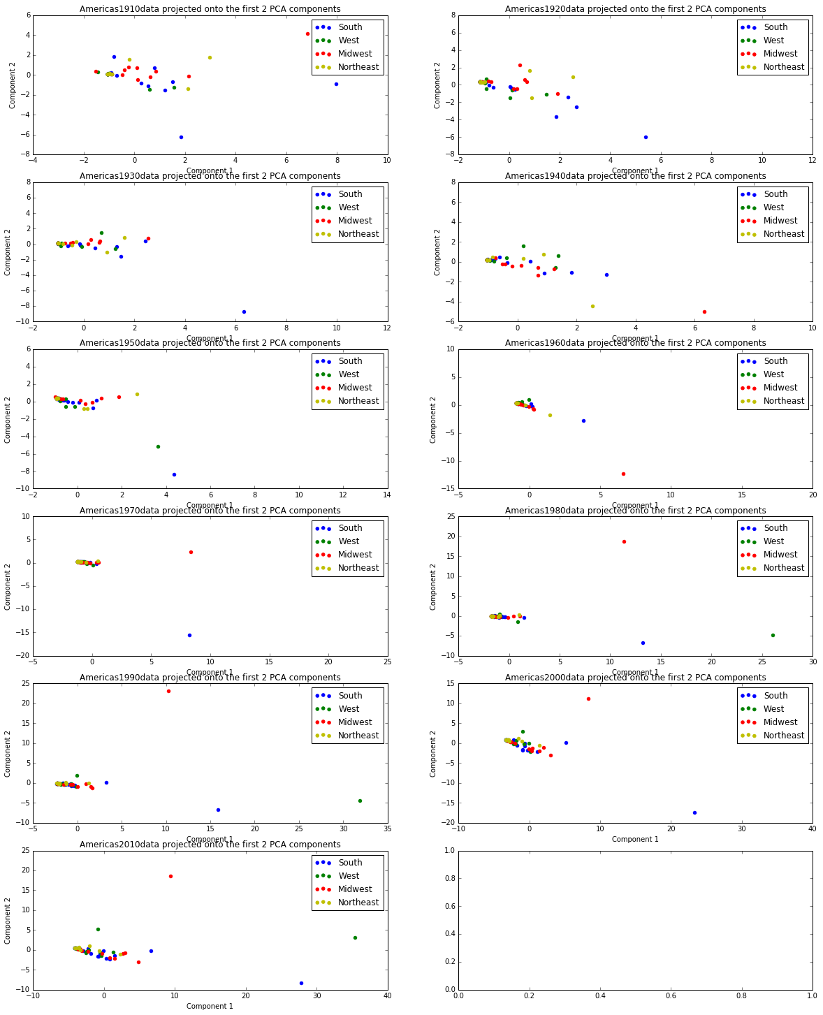
PCA for Americas
The Americas region begins more clustered than any of the other immigrant regions in 1910. The clustering becomes even denser as time goes on. At least one of two principal components for the American names are boy name, which is also different than the other regions where the variability predominantly comes from women’s names.
Takeaways
-
From our analysis, we see that the regional differences among names decrease over time. This could indicate increases in the exchange of information and cultural trends as technological innovations make it easier to communicate across long distances. Also, for the 5 regions, we see that there is less variance in the names during the earlier decades. As we get closer to the present, we start to see much more variation in the names across the country.
-
Women’s names are more variable and culturally indicative than men’s names. The majority of the principal components are girls names. This aligns with our prior research that the most popular names of all times were boys names (James, Charles, William) and that girls names were relatively more varied, and therefore less likely to be the all-time most popular.
References
-
Twenge, Jean M., Emodish M. Abebe, and W. Keith Campbell. “Fitting In or Standing Out: Trends in American Parents’ Choices for Children’s Names, 1880-2007.” Social Psychological and Personality Science 1.1 (2010): 19-25.
-
Barucca, Paolo, et al. “Cross-correlations of American baby names.” Proceedings of the National Academy of Sciences 112.26 (2015): 7943-7947.